The world of Quartz worktop colours extends far beyond the safe haven of neutrals. For the design enthusiast looking to make a unique statement, manufacturers now offer a breathtaking array of bold colours, dramatic patterns, and innovative designs. From deep emerald green to terrazzo-inspired speckles and veins of metallic gold, a bold quartz worktop can transform your kitchen into a true masterpiece of personal expression. This article explores the daring side of quartz, offering inspiration and guidance on how to harness powerful colours to create a show-stopping space.
Headings and Explanations:
1. Earthy and Organic Tones: Deep Greens, Navy Blues, and Burgundies
Inspired by the natural world, deep, saturated colours are a leading trend in bold quartz design. A forest green worktop can bring a sense of richness, tranquillity, and organic sophistication, pairing beautifully with natural wood cabinetry and brass fixtures for a look that is both luxurious and grounded. A navy blue quartz evokes a sense of depth and elegance, working perfectly as a dramatic anchor in a kitchen with white or light grey shaker cabinets. Rich burgundy or plum tones offer a warm, unexpected, and incredibly opulent alternative, creating a cozy and intimate atmosphere. These colours work best when treated as the focal point, with other elements in the room playing a supporting role.
2. The Terrazzo Revival: Playful, Retro, and Full of Character
Terrazzo, the composite material flecked with chips of marble, quartz, and glass, has made a major comeback. Quartz manufacturers have brilliantly replicated this look, offering a modern, durable, and seamless version. Terrazzo-effect quartz comes in a rainbow of base colours (from white to black) with flecks in contrasting hues like navy and gold, soft pastels, or classic grey and white. This style is inherently playful, energetic, and artistic. It adds a fantastic retro-modern vibe and is excellent at hiding stains and crumbs. It allows homeowners to inject personality and a sense of fun into their kitchen without committing to a single, overwhelming block of colour.
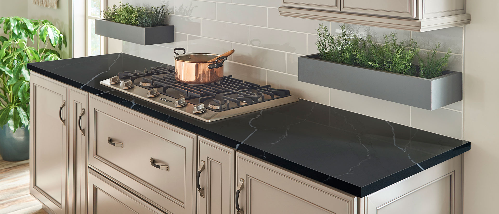
3. Metallic Inclusions and Dramatic Veining: The Ultimate Luxury
For those seeking unparalleled glamour, many quartz ranges now incorporate actual metallic elements. Imagine a classic white or black quartz base with bold, dramatic veins of copper, brass, or silver running through it. This creates a stunning, jewel-like effect that catches the light dynamically throughout the day. These surfaces are undeniable statement pieces that evoke luxury and high drama. They work exceptionally well in minimalist kitchens where the worktop can truly be the star of the show, complemented by matching metallic fixtures and hardware. This choice is for the confident designer who views the kitchen not just as a functional space but as a gallery for art.
4. Balancing the Bold: How to Design Around a Statement Worktop
The key to successfully implementing a bold Quartz worktop colours is careful curation of the rest of the space. The mantra is to “let the worktop shine.” This often means choosing cabinetry in neutral, muted tones white, grey, black, or natural wood that complement rather than compete with the worktop. Keep hardware and fixture finishes simple and consistent; if your quartz has gold veins, opt for gold taps and handles. Similarly, choose a backsplash that is simple, perhaps even a continuation of the worktop itself, to avoid visual clutter. By allowing the bold quartz to be the undeniable focal point, you create a cohesive, intentional, and breathtaking design that feels curated and confident, not chaotic.
For More Update and Stories Visit: The Europe Times